One sentence summary
Snow forecasting is hard, and we’ll use yesterday’s storm in the Eastern U.S. to show off some of the inherent challenges that exist.
Yesterday’s storm exposed the limitations of making consistently good snow forecasts
As a native of New Jersey and having spent the first 5 winters of my career in the lake effect snow belt, I know how tricky snow forecasting can be. There are endless amounts of complications with snow: Elevation, air temperature and snow ratio, dry slots, ground temperatures, sun angle, mixing, vertical velocity and relationship to the snow growth zone in the atmosphere, and on and on. It remains one of the more elusive forecast problems. My own opinion on this is that our ability to forecast snow has hit a bit of a plateau. I will admit that I don’t know if statistics actually bear that out. Hurricanes continue to show improvement, temperatures show improvement, but snow? Precipitation in general? I don’t know how much better it is today than 5 or 10 years ago. Feel free to blast me in the comments if that’s not accurate.
But, look, even if forecasts have improved considerably in the last 5 to 10 years, the inherent challenges with snow forecasting will always remain. Here’s an example.
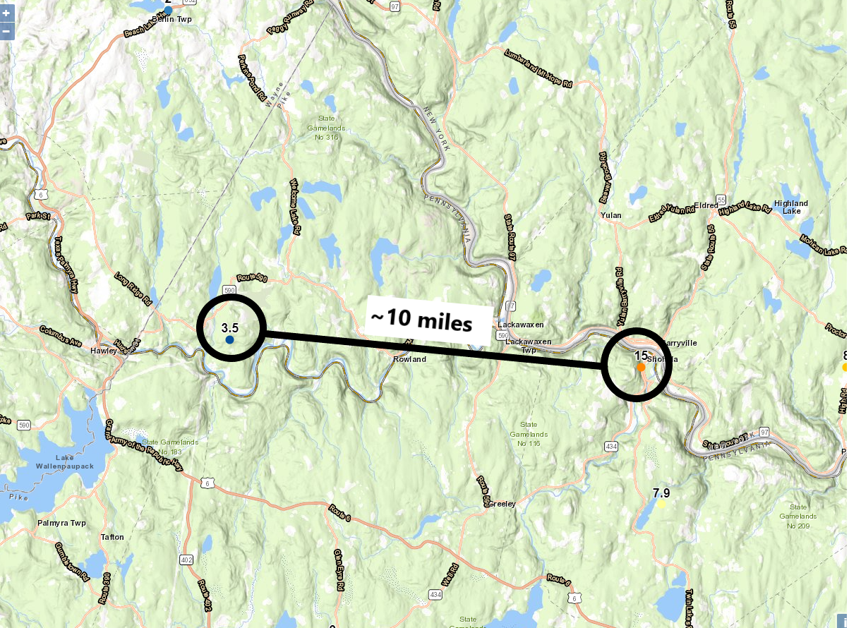
Yesterday morning, in northeast Pennsylvania, east of Scranton there was a pretty interesting scenario. In Shohola, on the Delaware River border with New York, 15 inches of snow was reported at 10 AM. About an hour later, roughly 10 miles west of Shohola, PA a total of 3.5 inches was reported just northeast of Lake Wallenpaupack. Doing some quick math, that comes out to near a foot of difference over 10 miles, or an average of over 1 inch of change in snow accumulation per mile.
Now, does this prove anything? No. We don’t know whether the measurement in Shohola was perfectly reliable. We don’t know what elevation it was taken from. I suspect the 3.5 inch report was from about 1,200 feet in elevation, and I don’t suspect the Shohola report was from much higher an elevation. But, you never know. Other reports nearby seem to corroborate it enough. But even if it’s 12 inches instead of 15, the point is still clear here: Snowfall gradients like these are common in Eastern U.S. snowstorms. They are the rule, not the exception.

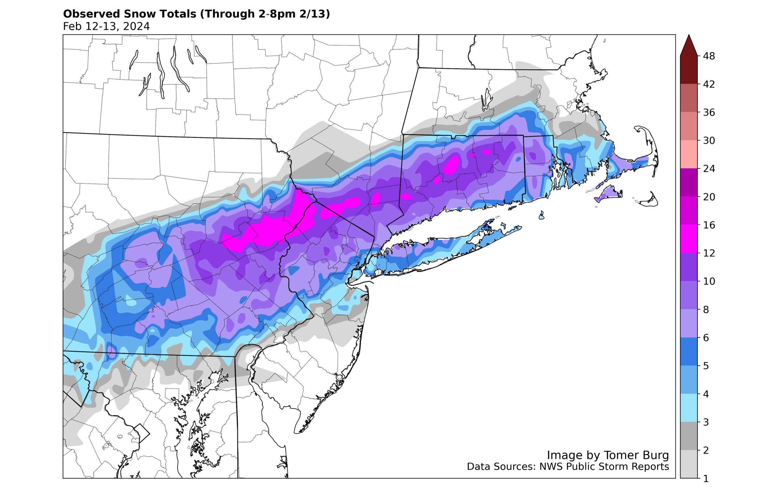
If you look at radar from yesterday morning in Pennsylvania, one of the key hurdles in snowfall forecasts shows up. We call this mesoscale banding. Weather modeling has come a long way in the last 10 to 15 years, but one of the trouble spots can occasionally be these mesoscale bands. You’ll get widespread, large scale snowstorms, like the one yesterday in the East. But embedded within the overall precipitation will be these narrow, sometimes stationary bands of snow. For those of you on the Gulf Coast, think of what happens when you get training lines of thunderstorms that cause flash flooding. In storms like the one yesterday, by a different process, you get a similar outcome but with snow. On the map above, you can see the roughly 10 mile separation between Shohola and Kimbles (where the 3.5 inch report came near). Over that distance at 6:30 AM ET, the radar shows heavy snow near or just southeast of Shohola, diminishing to light to moderate snow 10 miles west of there. The difference between the heavier snowband in yellow and the generic light to moderate snow can easily be 1 or 2 inches an hour. So, if that band parks there for 3 hours, you could easily see 5 to 7 inches of snow under it with 1 to 3 inches just west. Extrapolate that over a couple more hours or increase the snow rates in the heavier mesoscale band and, well, you get the idea.
Let’s look at another example. This one comes from Connecticut yesterday.

A report of 15.5 inches of snow occurred near Farmington, CT, which was placed precariously under that heavy band of snow you can see northwest of Hartford and north of I-84 if you look at the radar loop above. Notice how the area northwest of that snowband into Litchfield County, CT sees almost none of that. Well, that area to the northwest ended up with plenty of snow, about 4 to 8 inches worth in many spots.
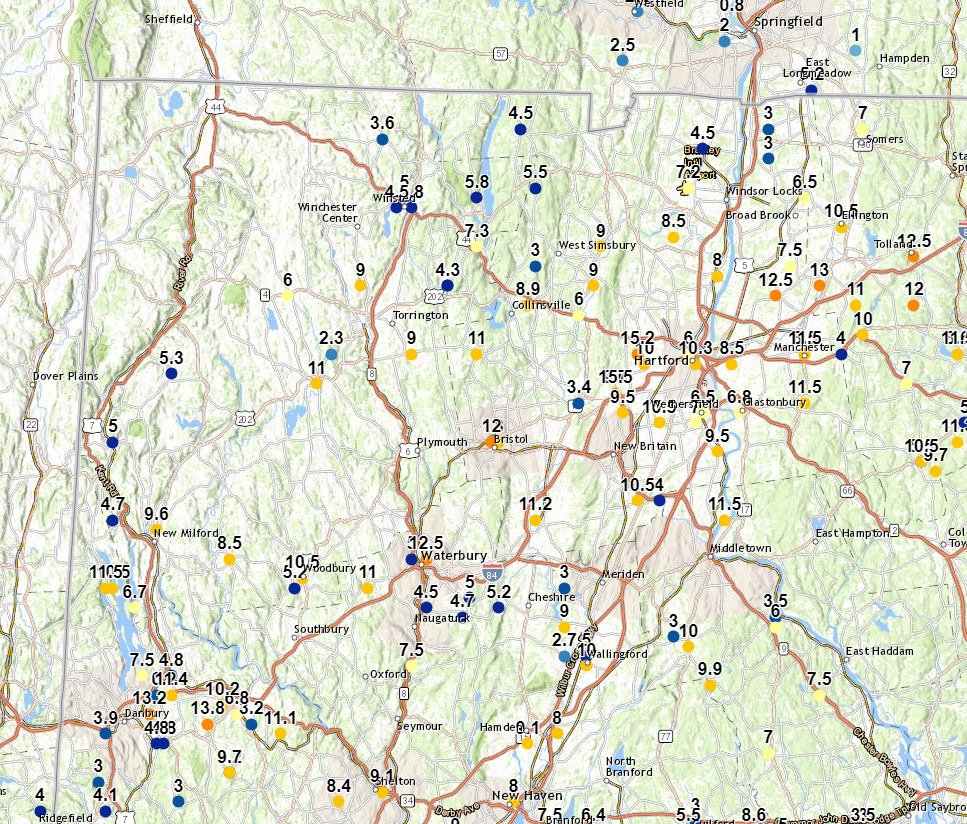
But you come just southeast of there, in the area from near Danbury through Waterbury through Bristol and Farmington out toward Tolland, and you see 10 to 15 inches of snow. Over short distances, you could have gone from 7 or 8 inches to 14 or 15 inches. Granted, both cause impacts, but nearly doubling up snow at those amounts can have severe ramifications on travel or forecast perception.
So why am I devoting a whole post to this topic? Well, for one, the East has seen a bit of a snow drought the last couple years, and it’s nice to revisit the idea that this stuff happens. But also, I saw a number of posts about threats, real or exaggerated, received by meteorologists because the forecast of this event busted in spots. Just a couple days ago, it looked like a broad, major New England storm. Some accused meteorologists of lying or just not being honest.
Here’s the truth: Snow forecasting is inherently difficult. You see the images above. Imagine now if that mesoscale band is forecast to be over Long Island and Central and Southern New Jersey in modeling ahead of the storm. Instead, when the storm happens, the band shifts northwest by about 25-35 miles and ends up over Philadelphia and New York City instead. Not to discount the southern half of Jersey (my homeland) or Long Island, but you’re talking about a shift where millions of people see considerably more snow than perhaps they expected. Or, even worse for perception, it ends up out to sea by 25 miles and now a few million fish get heavy snow instead of a few million people? Now, imagine if the models just simply give you little to no indication that the mesoscale snowband is going to setup at all? In these events, everything is connected. Trying to pin down storm track, trying to predict if and where banding will occur, trying to factor in temperatures in the air and on the ground (like yesterday where many places saw a lot of falling snow but not a lot of accumulating snow), or forecasting things like sleet or rain mixing in: It all matters. And the reality is, we’re decent at it all, but we’re not consistently great at it, and neither are models.
So it’s important to recognize that meteorologists try very hard to do good work during these events. Sometimes things change. Sometimes it’s at the last minute too. And that can lead to a significant forecast bust in some places. Or less a bust and more of an over or underestimate. It will happen again, and because of the geography of the Northeastern Megalopolis, there will be times where millions of people get outcomes that are somewhat unexpected. Just remember: No one is misleading you or lying to you. The atmosphere likes to challenge us, and some days we are left with egg on our face.
Good job on a difficult subject.
Thanks Matt…interesting topic.
Snow!?! The snow forecast here in Florida is always spot on!
Very cool!
🌬 ❄❄❄
☺️
When I lived in the northeast I called that 10 inches of partly cloudy. Shoveling that is one of the reasons I now live in Houston.
Thanks, Matt. Very informative and much appreciated. We had an 8″ snow prediction (coastal Plymouth County, MA) and got less than an inch.
The one area that forecasts could really improve, however, and relatively easily, is to use something other than 10 similar shades of blue and purple to illustrate the forecasts. 🙂 I know these are images you got from the weather services. If you have any sway with them, could you suggest adding other colors to the mix? If they’re worried about blue-green color blindness, even progressively darker shades of gray would be an improvement.
Thanks! I look forward to your articles
I think you do a terrific job at forecasting. I know it is a very difficult science. Thank you for all your hard work, especially during hurricane season.
This was very informative, thank you. We had a 3-6″ forecast for central Middlesex County, MA, and got less than an inch. As a survivor of the nightmare Blizzard of ’78, that was just fine with me!
Your efforts to unlock the mysteries of weather are greatly appreciated.
We’ve reached the limit of what 10 or even 3 km grid sizes can tell us. Parameterization (extrapolation) can only go so far. I’ve seen what 500 m grid can for aviation icing research and it’s really good! We’re stuck where we are until the computational capabilities increase by a few orders of magnitude.